 Image 1 of 1
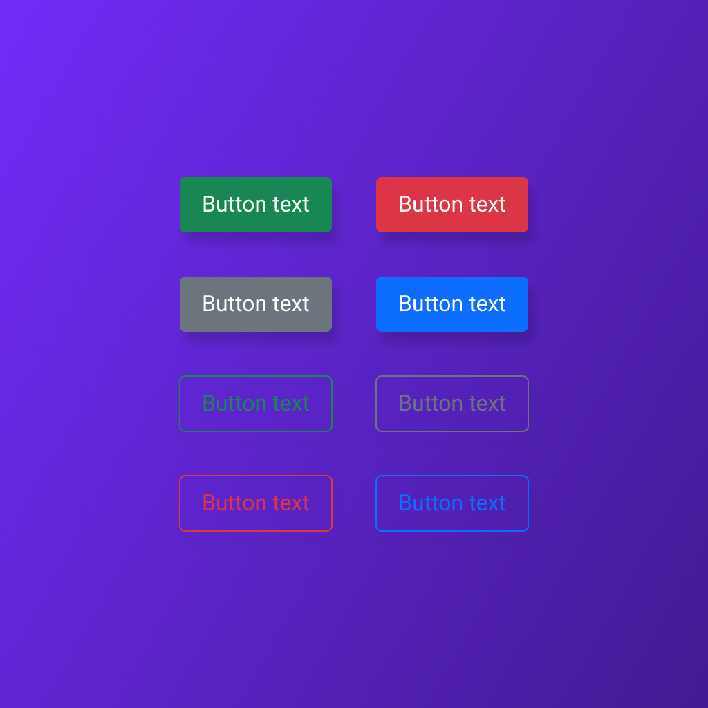
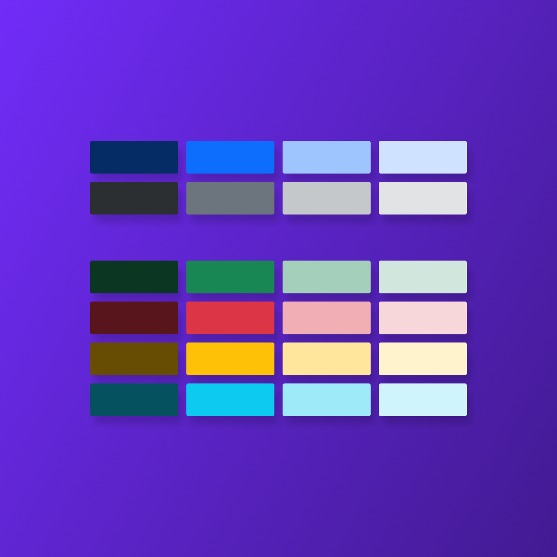
Build consistent, accessible interfaces faster with a complete Bootstrap 5.3 color palette organized as native Figma variables. This ready-to-use collection includes 34 color tokens across Primary, Secondary, Success, Danger, Warning, Info, Light, and Dark groups, plus foundational black and white values.
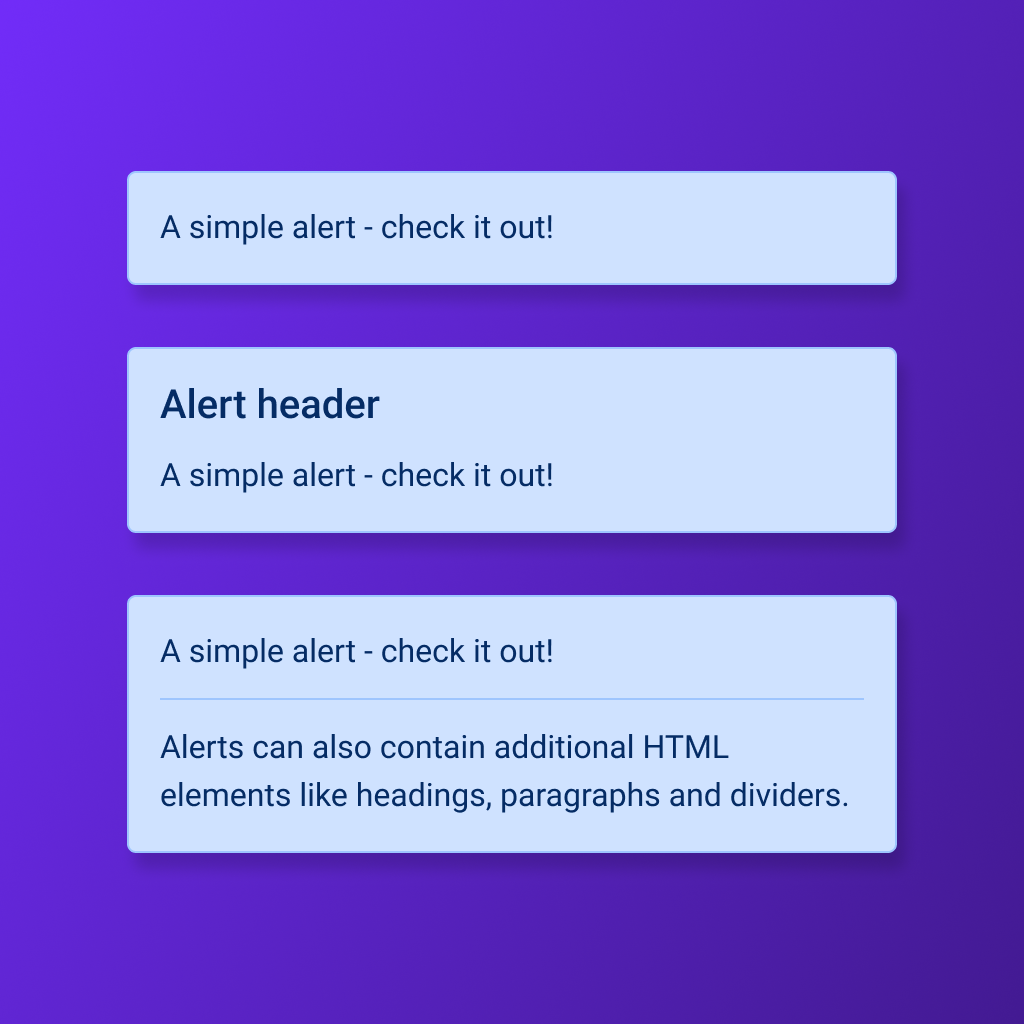
Designed for streamlined UI workflows, each color is structured by semantic role and shade, making it easy to apply consistent styling across buttons, alerts, backgrounds, text, forms, and component states. Perfect for designers building Bootstrap-based products, design systems, prototypes, or developer-ready handoff files.
Includes:
34 organized Figma color variables
Bootstrap 5.3 semantic color groups
Dark, default, medium, and light variations
Black and white foundation tokens
Clean, scalable structure for design systems
Build consistent, accessible interfaces faster with a complete Bootstrap 5.3 color palette organized as native Figma variables. This ready-to-use collection includes 34 color tokens across Primary, Secondary, Success, Danger, Warning, Info, Light, and Dark groups, plus foundational black and white values.
Designed for streamlined UI workflows, each color is structured by semantic role and shade, making it easy to apply consistent styling across buttons, alerts, backgrounds, text, forms, and component states. Perfect for designers building Bootstrap-based products, design systems, prototypes, or developer-ready handoff files.
Includes:
34 organized Figma color variables
Bootstrap 5.3 semantic color groups
Dark, default, medium, and light variations
Black and white foundation tokens
Clean, scalable structure for design systems