Motif
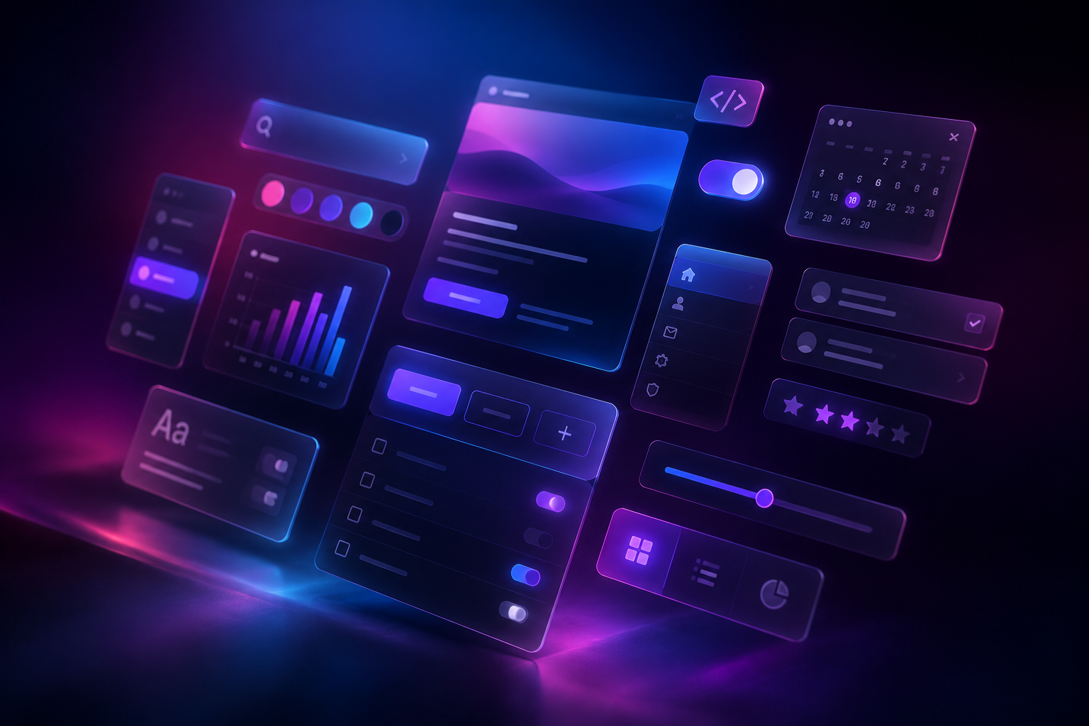
Design Faster with Reusable Figma UI Systems
Organized styles and components built for consistent, scalable product design.
Built for Modern UX Workflows
Motif creates reusable Figma assets that help designers build faster, maintain consistency, and spend less time recreating familiar interface patterns.
Motif libraries are designed for the interfaces designers build every day.
From foundations and icons to reusable components, each asset is organized for faster browsing, cleaner implementation, and more confident design decisions.

Build clear, consistent interfaces faster with a reusable Roboto typography style library organized for practical Figma workflows. This ready-to-use collection provides flexible text styles based on size, weight, and treatment, making it easy to apply consistent typography across products, websites, applications, and prototypes.
Designed to remain adaptable across design systems, each style uses straightforward naming rather than fixed semantic roles, so the same typography foundation can support headings, body text, labels, captions, links, and interface content wherever needed.
Includes:
Organized Roboto Figma text styles
Common interface font sizes
Regular and bold weight variations
Italic and underline text treatments
Flexible, scalable naming structure
Clean typography foundation for digital products
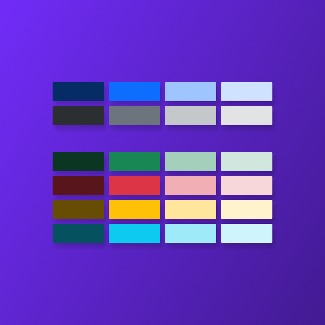
Build consistent, accessible interfaces faster with a complete Bootstrap 5.3 color palette organized as native Figma variables. This ready-to-use collection includes 34 color tokens across Primary, Secondary, Success, Danger, Warning, Info, Light, and Dark groups, plus foundational black and white values.
Designed for streamlined UI workflows, each color is structured by semantic role and shade, making it easy to apply consistent styling across buttons, alerts, backgrounds, text, forms, and component states. Perfect for designers building Bootstrap-based products, design systems, prototypes, or developer-ready handoff files.
Includes:
34 organized Figma color variables
Bootstrap 5.3 semantic color groups
Dark, default, medium, and light variations
Black and white foundation tokens
Clean, scalable structure for design systems
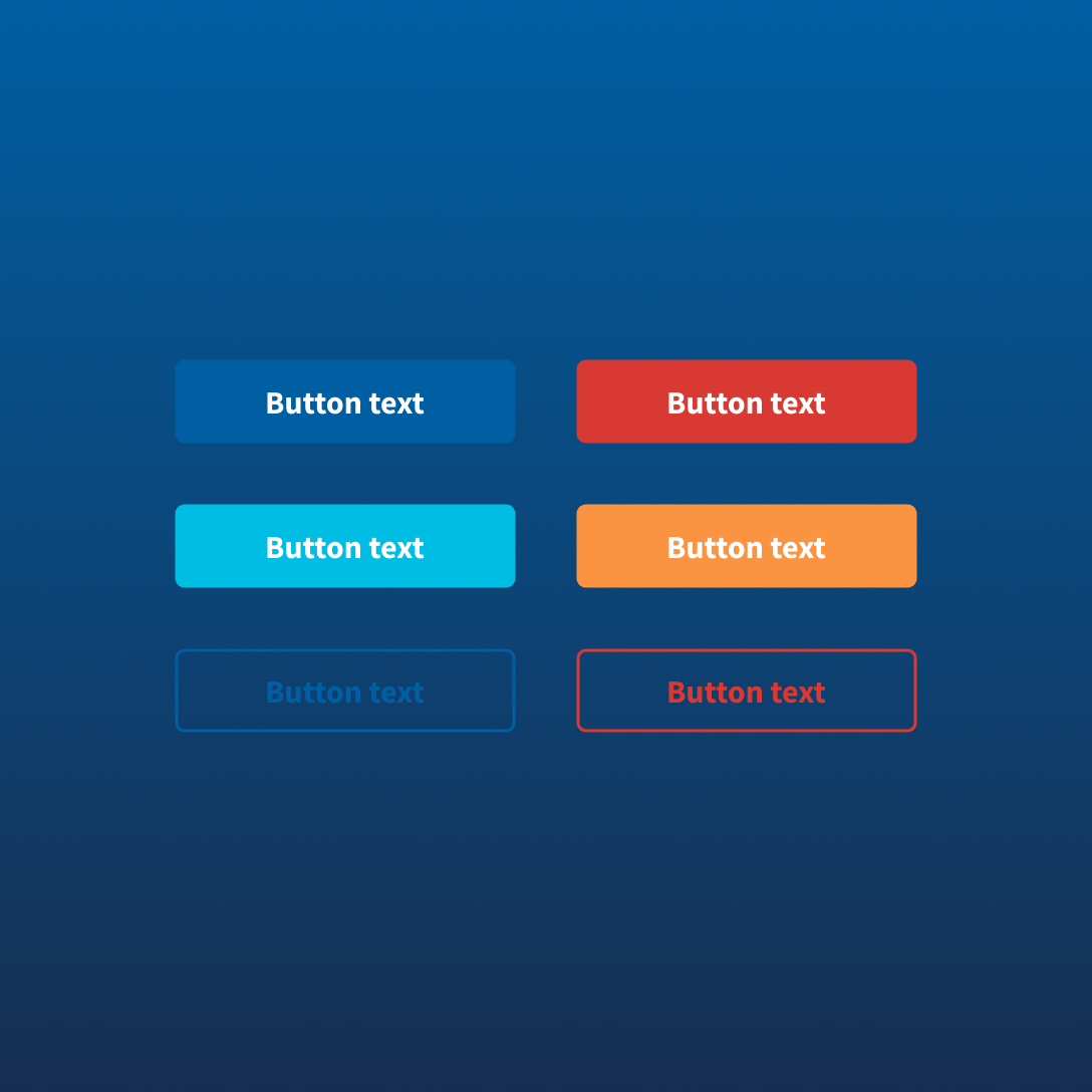
Build accessible, consistent government digital experiences faster with a reusable USWDS button component librarydesigned for practical Figma workflows. This ready-to-use collection includes button styles and states aligned to the U.S. Web Design System, making it easy to create clear actions across forms, services, applications, and content-driven interfaces.
Designed for modern product work, each button is organized for consistent usage across primary actions, secondary actions, high-contrast contexts, and common interaction states. Ideal for designers working on government, civic technology, public service, or accessibility-focused digital products.
Includes:
Organized USWDS button components
Primary, secondary, accent, outline, inverse, and unstyled variations
Hover, active, focus, disabled, and loading states
Icon and non-icon configurations
Flexible component structure for Figma workflows
Practical foundation for accessible action patterns