 Image 1 of 5
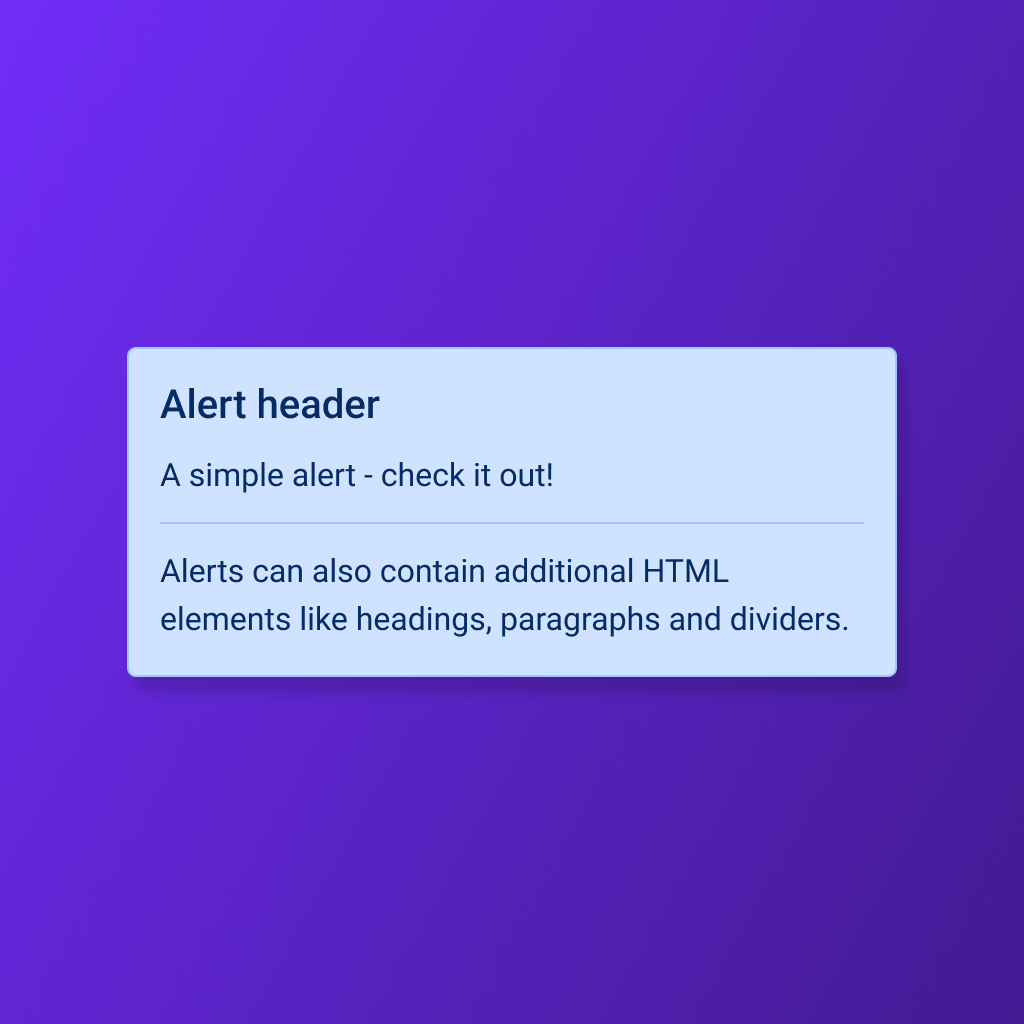 Image 2 of 5
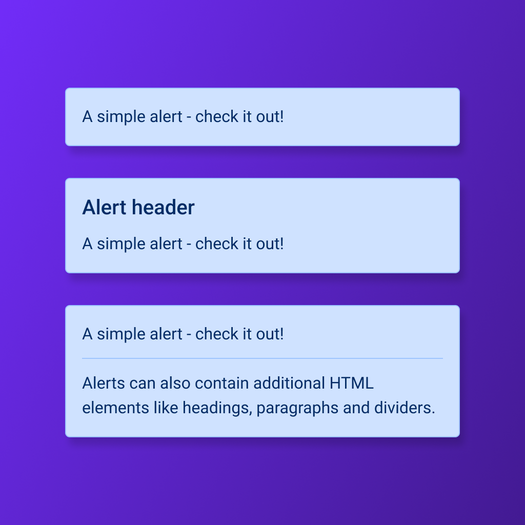 Image 3 of 5
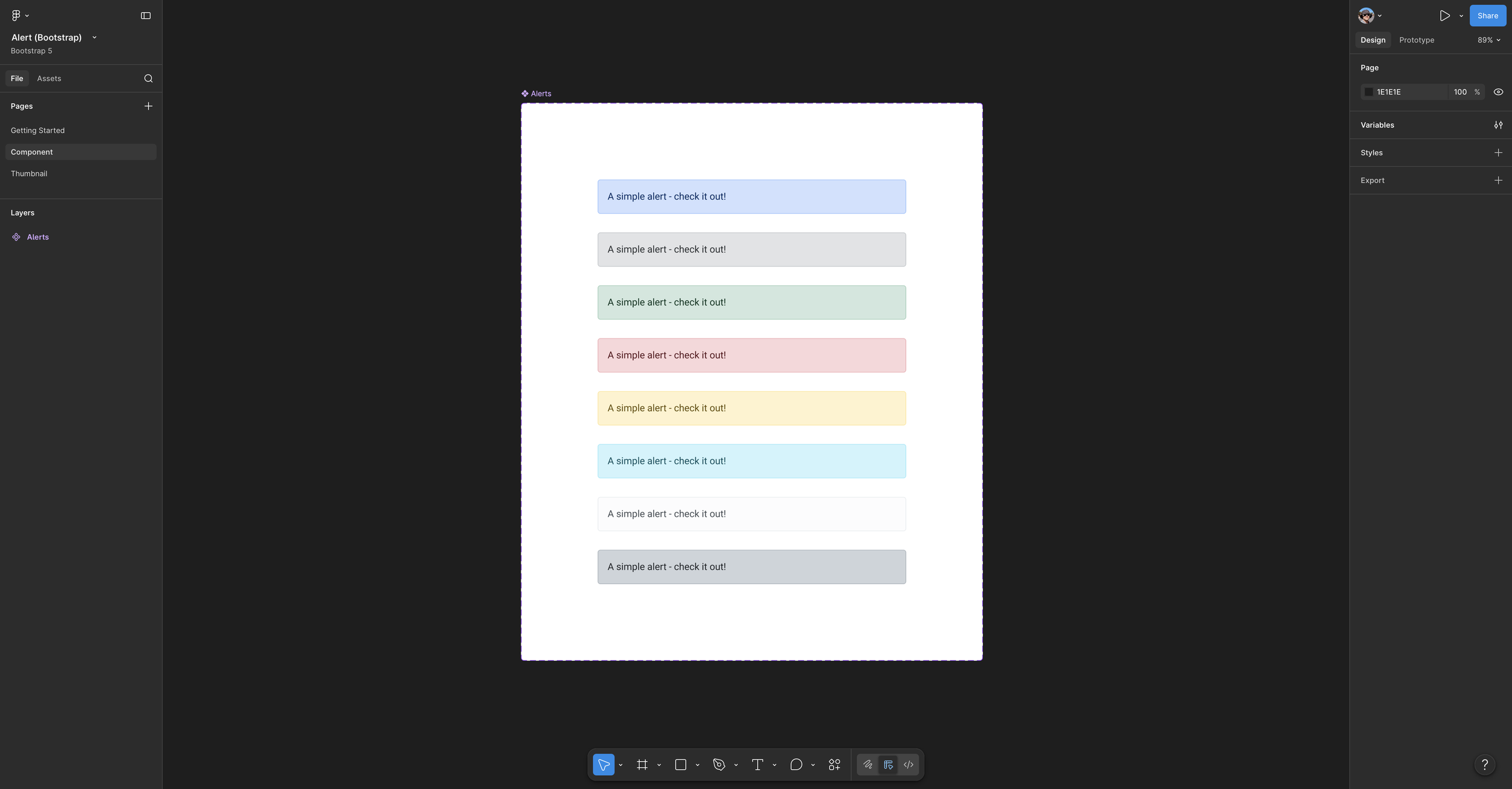 Image 4 of 5
 Image 5 of 5
Design clear, consistent system feedback faster with a reusable Bootstrap alert component library built for practical Figma workflows. This ready-to-use collection includes familiar alert patterns for communicating important information, warnings, errors, and successful outcomes across modern digital products.
Designed for flexible interface work, each alert supports recognizable messaging across forms, confirmations, dashboards, settings, and task-based experiences. Ideal for designers building Bootstrap-based applications, websites, design systems, prototypes, or developer-ready handoff files.
Includes:
Organized Bootstrap alert components
Primary, secondary, success, danger, warning, info, light, and dark variations
Alert configurations with and without headings
Clear messaging structure for common interface states
Flexible component organization for Figma workflows
Practical foundation for consistent system feedback
Design clear, consistent system feedback faster with a reusable Bootstrap alert component library built for practical Figma workflows. This ready-to-use collection includes familiar alert patterns for communicating important information, warnings, errors, and successful outcomes across modern digital products.
Designed for flexible interface work, each alert supports recognizable messaging across forms, confirmations, dashboards, settings, and task-based experiences. Ideal for designers building Bootstrap-based applications, websites, design systems, prototypes, or developer-ready handoff files.
Includes:
Organized Bootstrap alert components
Primary, secondary, success, danger, warning, info, light, and dark variations
Alert configurations with and without headings
Clear messaging structure for common interface states
Flexible component organization for Figma workflows
Practical foundation for consistent system feedback