 Image 1 of 2
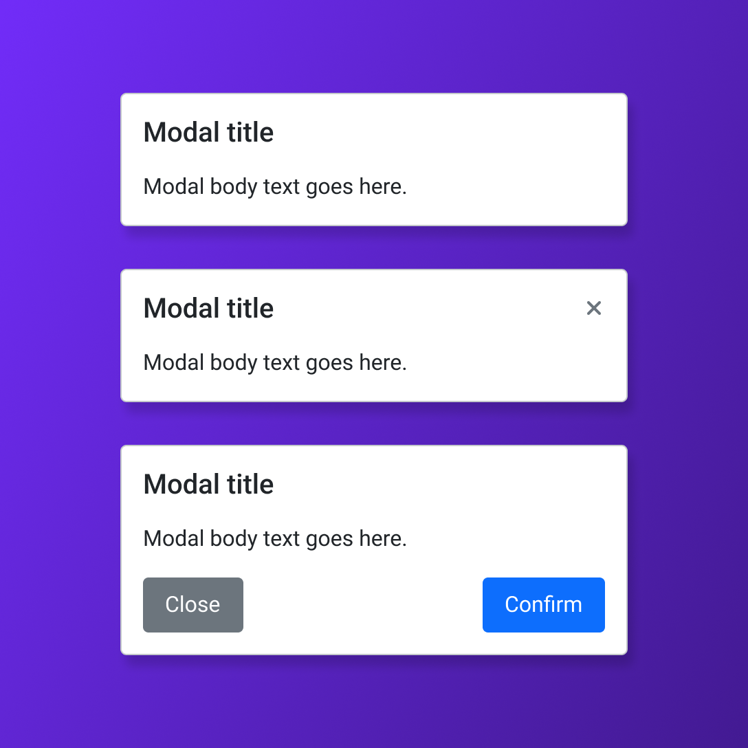 Image 2 of 2
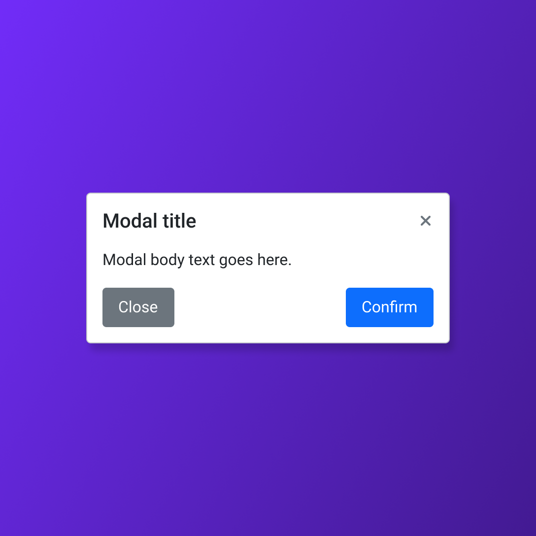
Create focused, consistent interface flows faster with a reusable Bootstrap modal component library designed for practical Figma workflows. This ready-to-use collection makes it easy to design dialogs for confirmations, forms, alerts, details, and task-based interactions across modern digital products.
Designed for flexible product work, each modal is structured to support clear hierarchy, purposeful actions, and consistent presentation across common overlay experiences. Ideal for designers building Bootstrap-based applications, dashboards, websites, design systems, prototypes, or developer-ready handoff files.
Includes:
Organized Bootstrap modal components
Modal layouts for common dialog use cases
Header, body, and footer content regions
Action-ready configurations for interface workflows
Flexible component structure for Figma libraries
Practical foundation for focused overlay interactions
Create focused, consistent interface flows faster with a reusable Bootstrap modal component library designed for practical Figma workflows. This ready-to-use collection makes it easy to design dialogs for confirmations, forms, alerts, details, and task-based interactions across modern digital products.
Designed for flexible product work, each modal is structured to support clear hierarchy, purposeful actions, and consistent presentation across common overlay experiences. Ideal for designers building Bootstrap-based applications, dashboards, websites, design systems, prototypes, or developer-ready handoff files.
Includes:
Organized Bootstrap modal components
Modal layouts for common dialog use cases
Header, body, and footer content regions
Action-ready configurations for interface workflows
Flexible component structure for Figma libraries
Practical foundation for focused overlay interactions