 Image 1 of 1
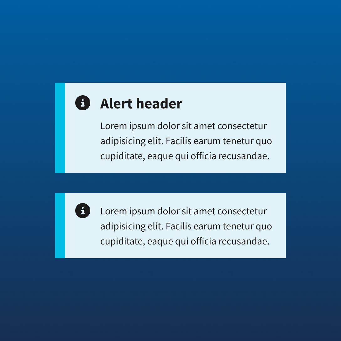
Design clear, accessible system messaging faster with a reusable USWDS alert component library built for practical Figma workflows. This ready-to-use collection includes alert patterns aligned to the U.S. Web Design System, making it easy to communicate important information, warnings, errors, and success states across government and public-service digital experiences.
Designed for clarity and consistency, each alert supports recognizable messaging patterns across forms, applications, confirmations, service updates, and content-driven interfaces. Ideal for designers working on government, civic technology, public service, or accessibility-focused products.
Includes:
Organized USWDS alert components
Informational, warning, error, success, and emergency variations
Alert configurations with and without headings
Clear messaging structure for common interface states
Flexible component organization for Figma workflows
Practical foundation for accessible system feedback
Design clear, accessible system messaging faster with a reusable USWDS alert component library built for practical Figma workflows. This ready-to-use collection includes alert patterns aligned to the U.S. Web Design System, making it easy to communicate important information, warnings, errors, and success states across government and public-service digital experiences.
Designed for clarity and consistency, each alert supports recognizable messaging patterns across forms, applications, confirmations, service updates, and content-driven interfaces. Ideal for designers working on government, civic technology, public service, or accessibility-focused products.
Includes:
Organized USWDS alert components
Informational, warning, error, success, and emergency variations
Alert configurations with and without headings
Clear messaging structure for common interface states
Flexible component organization for Figma workflows
Practical foundation for accessible system feedback