 Image 1 of 1
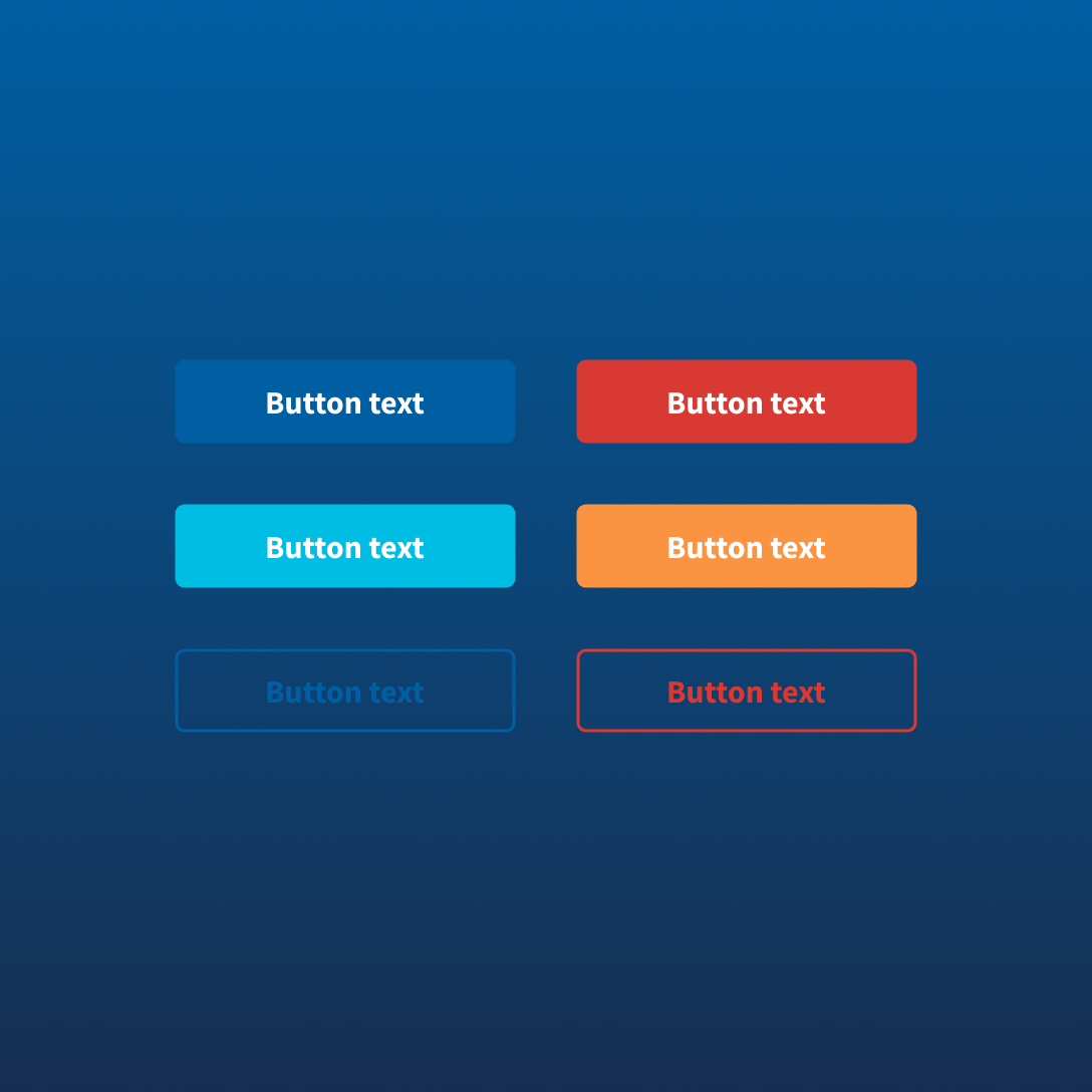
Build accessible, consistent government digital experiences faster with a reusable USWDS button component librarydesigned for practical Figma workflows. This ready-to-use collection includes button styles and states aligned to the U.S. Web Design System, making it easy to create clear actions across forms, services, applications, and content-driven interfaces.
Designed for modern product work, each button is organized for consistent usage across primary actions, secondary actions, high-contrast contexts, and common interaction states. Ideal for designers working on government, civic technology, public service, or accessibility-focused digital products.
Includes:
Organized USWDS button components
Primary, secondary, accent, outline, inverse, and unstyled variations
Hover, active, focus, disabled, and loading states
Icon and non-icon configurations
Flexible component structure for Figma workflows
Practical foundation for accessible action patterns
Build accessible, consistent government digital experiences faster with a reusable USWDS button component librarydesigned for practical Figma workflows. This ready-to-use collection includes button styles and states aligned to the U.S. Web Design System, making it easy to create clear actions across forms, services, applications, and content-driven interfaces.
Designed for modern product work, each button is organized for consistent usage across primary actions, secondary actions, high-contrast contexts, and common interaction states. Ideal for designers working on government, civic technology, public service, or accessibility-focused digital products.
Includes:
Organized USWDS button components
Primary, secondary, accent, outline, inverse, and unstyled variations
Hover, active, focus, disabled, and loading states
Icon and non-icon configurations
Flexible component structure for Figma workflows
Practical foundation for accessible action patterns